Yelp for Everyone
Research and design by Sarah Paulhus
Oct 2019

INTRO
Everybody eats.
Dining while disabled is a completely difference experience that most able-bodied persons don’t understand. Generally, people with access needs either call ahead [to a restaurant] or send a scout, because despite the law, you can’t assume access will be possible. 1 in 7 people worldwide have a disability or impairment that affects the way they interact with the world and their devices, which is a huge number of people that we are not fully accounting for when designing spaces and experiences.
“You have this huge segment of [disabled] paying customers who want to go out. Think about how menus are organized per specific diets and allergies. It’s all part of that same theme: to be able to serve all kinds of customers.”
Too often, accessibility is a late concern in the design process, or not a concern at all. It’s also been a hot topic lately. When researching the topic recently, I came across an app in development that was touted as “The Yelp of Accessibility” to help the disabled find restaurants and bars that they could access, and I thought to myself “Why wouldn’t Yelp just do this?” Why should people with disabilities (or people who are planning events with people with disabilities) have to have a separate site for this information?
“You can literally search how much the beer is going to be that night, if there’s any amazing reviews, you can find out anything about that place. You can’t find out if it’s accessible.”
Unfortunately, just because the ADA exists does not mean it is universally adhered to by every restaurant or cafe. But we can make the experience of finding a suitable restaurant more valuable and accessible to all. Clarity about disability access is just one way to make restaurants more welcoming to disabled people. Being able to search for one is another.
How Yelp can help

Current Yelp app design
The Yelp app can’t solve every problem, but it can improve in three big ways to create a better experience for a wider audience. The first is within its visual design, making sure the design of their app is accommodate to those with blindness, color blindness, and all forms of vision loss. The app can also be optimized for those with limited fine motor control, or difficulty holding/using their devices by making sure buttons and hierarchy are clear.
Finally, users should be able to access clear information about all ADA compliance at any location, not just wheelchair access, and know that it’s been verified by other users.
Where design falls short
Yelp can make sure they are visually optimizing their app in three ways:
Color contrast
For those with lesser vision or color blindness, color contrast should hit certain ratios based on how and where the color is being used to appear most clear. With the exception of the salmon red color, all colors fail color contrasts tests for how the color is being used. For the gray and green, trying to use those colors in small text sizes is inaccessible. For the blue, forcing small white text on top of it is also not acceptable for accessibility standards.

Text size & magnification
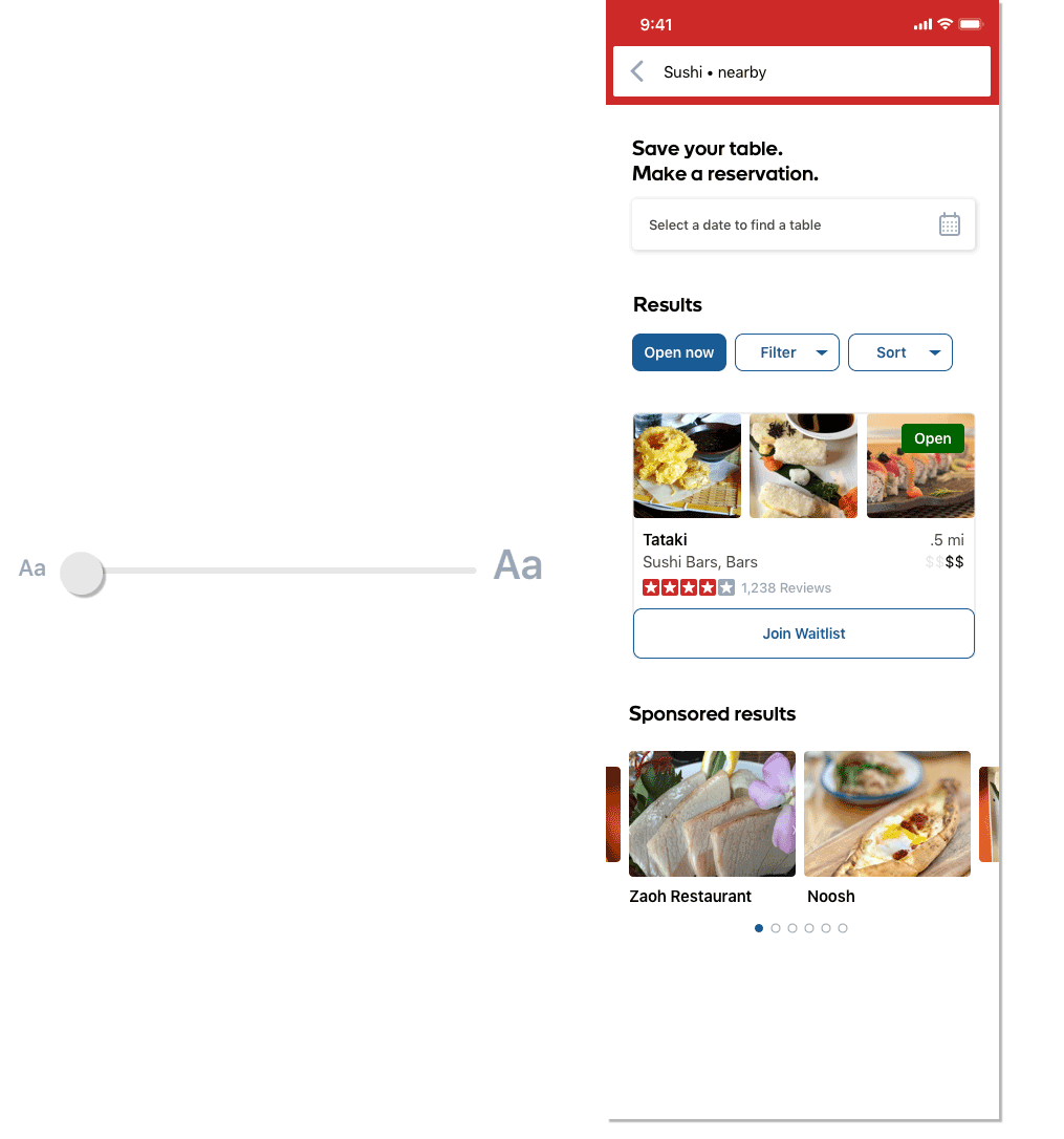
For clarity and readability, text size and weight should never get too small or too light, and text magnification should scale the text and not break the design. After taking a look at Yelp’s text sizing through the app, I’ve also turned on Large Format text sizing to see how the app scales. As you can see, the app is not designed to support text scaling by the operating system.

On the left, the original app. On the right, I’ve turned up Large Formatting text. Nothing has changed.
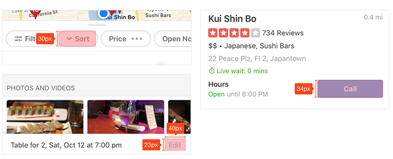
Touch target sizes
To accommodate for the largest range of hand sizes and accuracy of a tap, touch targets should be at least 9mm x 9mm and surrounded by a small amount of inactive space. There are many area’s where Yelp’s app falls short of the standard 48p x 48p standard tap size.
Finding accessibility information
Yelp can also do a better job at connecting disabled users with the information they need about finding a restaurant or destination that meets their needs.
Accommodating all disabilities
It’s easy to take a glance at a Yelp review that says, “Wheelchair Accessible: Yes,” and assume that means a restaurant is fully accessible to everyone. But that belies the many nuances of living with a disability: Not everyone uses a wheelchair, for one. For example, access for a blind person would need a completely different set of accommodations, such as a Braille menu.
Accuracy of accessibility info
There are limitations to trusting Yelp for accessibility details: “Who’s filling out that box? Does Yelp even verify that info?” are frequently asked questions by users. Anyone could check that box for any business online, but even workers at these places aren’t sure about ADA compliance. “Can you independently get into the business?" "Can you independently navigate around?" Some of these things are hard to know until someone actually tests them out.

“We could get a lot better about making information about accessibility more… accessible.”
David Perry, Disability rights journalist
SOLUTION
A better design for all

Design updates
There are some easy changes to the design system that will greatly improve accessibility and allow for a wider audience to use and find what they are looking for.
Color
While maintaining Yelp’s primary red brand color, I was able to update the UI palette to be completely compliant with contrast standards.

Scalable typography
All text was updated so that nothing was below the average readable size of 15p. By adding explicit padding and spacing rules, I’ve also designed the layout to accommodate an increase in text size from the Dynamic Type on the operating system.
Balanced layout
To accommodate for physical mobility limitations, the most primary buttons and tap areas expand the full width of the design, so that it’s tappable whether you're reaching from the right or left.
Eliminating UI on photos
For most visibility of important buttons, I’ve taken all small icons off of the top of photos and either added them onto color backgrounds, or on top of strong, dark gradients.

Making content relevant
List all ADA features
I’ve updated Yelp to take “Wheelchair Accessible” out of the Amenities tab (it’s not an amenity), and have added accessibility as it’s own section on the Information page. All possible accessibility needs are listed.

Verifying accessibility and amenities
In order to get the most accurate information about a location without have to search deep into reviews, I’ve added a differentiator between non-verified and verified features. Verified features will be indicated by a green check and include the number of customers who have approved.

Elevate relevant content
In the current design, the user has to scroll a bit past sponsored results before getting to what they need. Not only is showing sponsored results first visually confusing to the user, when using Screen Reading technology, it also slows down the time for a customer to find relevant content.
I’ve both moved Sponsored Posts down the page, but also differentiated their design from real search results to further add clarity to your search.

CONCLUSION
A better experience for all
A more accessible app means more users can actively use it, navigate the app, and find what they are looking for. With more people using the app and finding restaurants and experiences, ultimately Yelp will continue to thrive as the go-to source for peer-reviewed businesses.
Even more importantly, disabled people who are made to feel welcome at businesses talk to each other, sharing restaurant recommendations with other members of the community, where many disabled activists organize and talk to each other. My hope is that because the redesigned app will expose a location’s accessibility features, like ramps and accessible bathrooms, this would incentivize more restaurants to implement these for this customer base to keep up with competitors.