Angels take flight
Design by Sarah Paulhus with R/GA
May 2021

INTRO
Setting a new standard for women’s sports
In 2021 we were hired by a new emerging sports organization who were working hard to create the newest team in the National Women’s Soccer League. This new team is founded by a group of female entrepreneurs and investors who wanted to make a difference in the world of sport while giving back to the community and supporting the growth of women’s sports. This Los Angeles-based team would be called Angel City Football Club.
The launch of ACFC in 2020 follows right behind the USWNT's Equal Pay Lawsuit, in which the US women players contended they had been subjected to years of unequal treatment and compensation. Equality in sports can only be achieved when players and fans come together around shared movement and ACFC wants to be at the front of that historical shift, promising fair pay and treatment to their players and staff. The launch of this team is a call-to-action, galvanizing both fans and players, locally and globally. We were asked to contribute to the marketing efforts by bringing the new brand to life though strategy, communication, and visual design.
Our goal is to inspire fans to help build ACFC and its new sports culture from the ground up. We want to establish the ACFC brand as an iconic symbol of gender equality as it reflects our shared values and present need for social justice and equality for women in sports.

Current design system
NEW brand position
Untamed together.
Moodboard
INSPIRATION
I drew all of my inspiration for the visual design from ACFC’s existing logo, with features a bird/angel symbol breaking out of a crest shape, looking upwards and almost “taking flight” in an optimistic and energetic fashion. I loved the concept of “breaking free” of the standards set before us, and “taking flight” as it relates to both the translation of the city name (Los Angeles/City of Angels) and the energetic game of soccer, with players jumping and leaping to fight for the ball.
My goal was to try to convey this energy and optimism while also continuing to nod to the home city of LA and its culture.

Brand elements
concept
Break the mold.
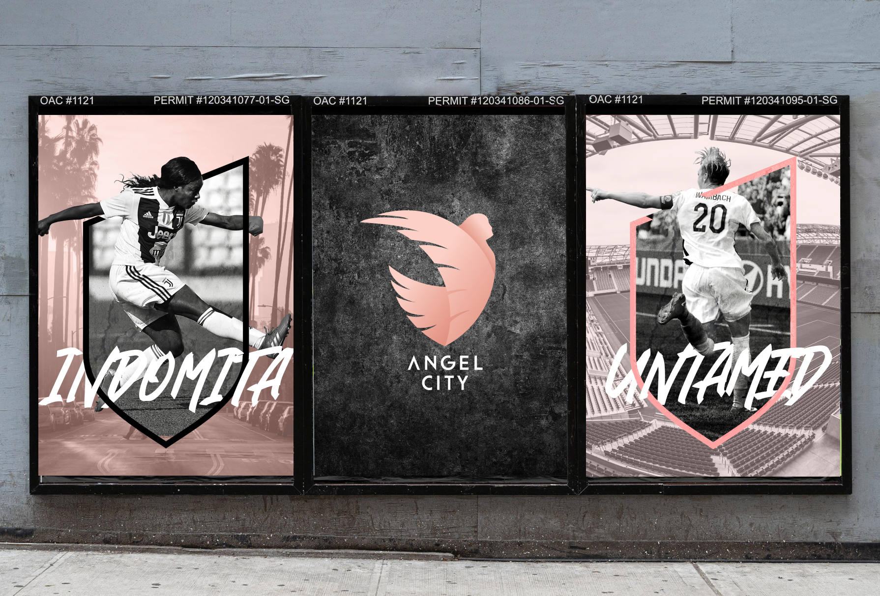
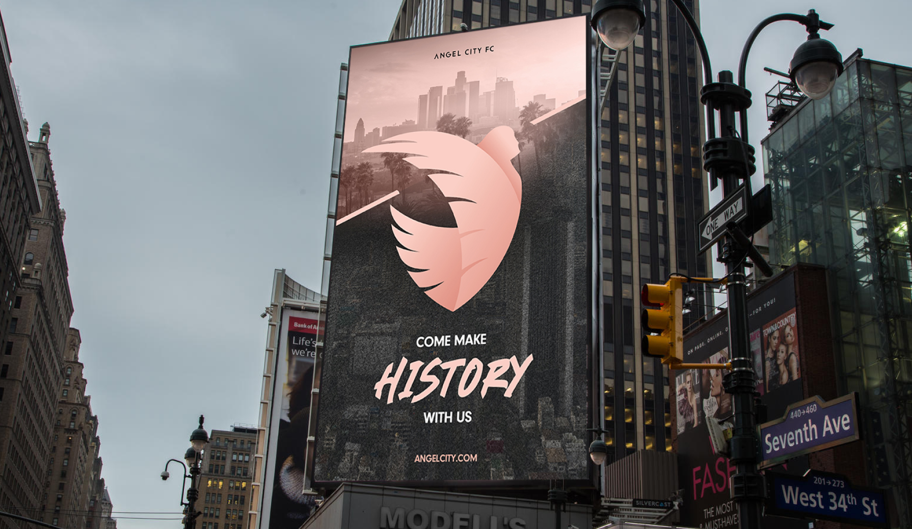
Our visual concept is centered around defying the expected and breaking the mold. This is mostly achieved by incorporate framing devices that are consistently broken out of, similar to the crest. This can include people breaking through shapes, typography, or text breaking through lines, or using the lines/shapes inspired by the logo breaking out of frame. More broadly, this encourages ACFC to seize opportunity to break conventions and do things unexpectedly.
In addition, I also took inspiration from a quote I got about LA, which mentioned “From concrete to coast” in reference to wide range and juxtaposition of landscapes and cultures that you can find in LA. To bring the brand home, I’ve integrated muted photography and textural backgrounds representing the different parts of the city of LA.
Alongside the logo, we’ve also expanded their brand kit of elements and introduced a new secondary typeface, a hand-drawn sketchy font that can bring in a tone of rebellion and freedom to compliment their existing bold face.
VOICE
In addition to the visuals, we also advised ACFC on communication style and tone. Overall, this brand relies so heavily on the support of fans so our tone really centers around inviting people to take action alongside us to build community. We try to always be optimistic, motivational and outspoken. The brand is proud, confident and empowering.
We know that Spanish is widely spoken throughout southern California, so we wanted to embrace the hispanic audience where relevant with the use of both Spanish and Spanglish. We’ve integrated the translation for ‘Untamed” in many of our artifacts as well as using the tagline “Hace historia con nosotros” (“Come make history with us”).


challenges
Our biggest challenge in creating a visual identity for ACFC was that because they were a brand new team, they didn’t actually have players yet, which means we had nobody that we could use in any final visuals. We know that players are a huge draw for advertising a team and games, so we had to think of different, exciting ways to create energy in the visuals knowing it would be awhile before we could use people.
We solved this in multiple ways: 1. While the team didn’t have players signed, they did have investors who are former players that gave permission to use their photos. Abby Wambach and Julie Foucher were examples of this. 2. Lean on the brand symbol of the bird/angel as the main focal point, 3. Use photography that does not identify the subject, either in the way it was shot or the way we treated the photograph (using a silhouette of the image for example) and finally 4. Use photos of fans and supporters instead. this was easy because ACFC already had such a built-up fanbase who are super energetic about the game, so we had tons of great photography.


credits
This work was created at R/GA California with my team, including Iggy Rodriguez, Natalia Fredericks, Scott Steele, Bernice Chao, and Kaitlyn Frysztak.